Stonly Steps Up Interactive Guides
It says a helluva lot when a website explaining the benefits of a digital tool uses that very tool to do the explaining.
The tool in question is Stonly, which is a digital tool used precisely for explaining how to use other digital tools, like how to navigate a website, or how to field a customer’s questions from an extensive knowledge base.

The house that stones built
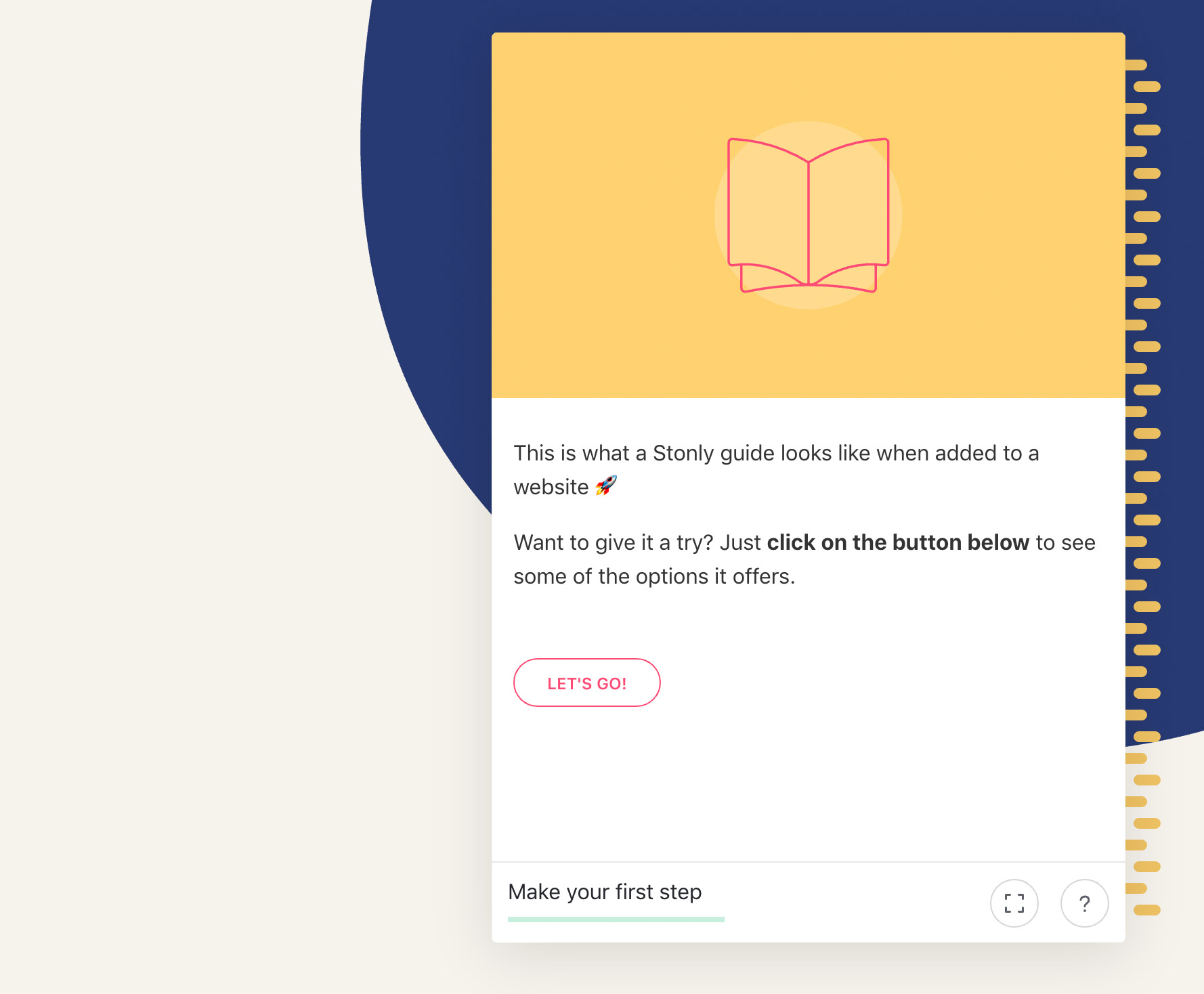
When you land on Stonly’s website, every explanation for how it works, and why it’s great, is done using the Stonly system. By the time you get the gist of what it is, you’ve already absorbed how it works.
And in the realm of tech tools and sophisticated SaaS, complicated CRMs and overwhelming ERPs, well, it’s quite refreshing when a company’s website isn’t just overly flattering copy, vacuous content, nerdy spec-flexing, and a Dantean-descent down hyperlink inferno.
Nope, Stonly’s website tells—or shows it straight. That’s the point. Stonly allows you to simply, and straight-forwardly, step-by-step walk your customers through everything they need to know about whatever it is you want to show them.
Stonly keeps a few steps ahead of a lot of other onboarding and learning-curve guides by being interactive, meaning users engaging with it communicate with you if certain steps are unclear or problematic. It also has great insights as to how users are doing at every step of their explanatory trek.

A hike up and down Stonly
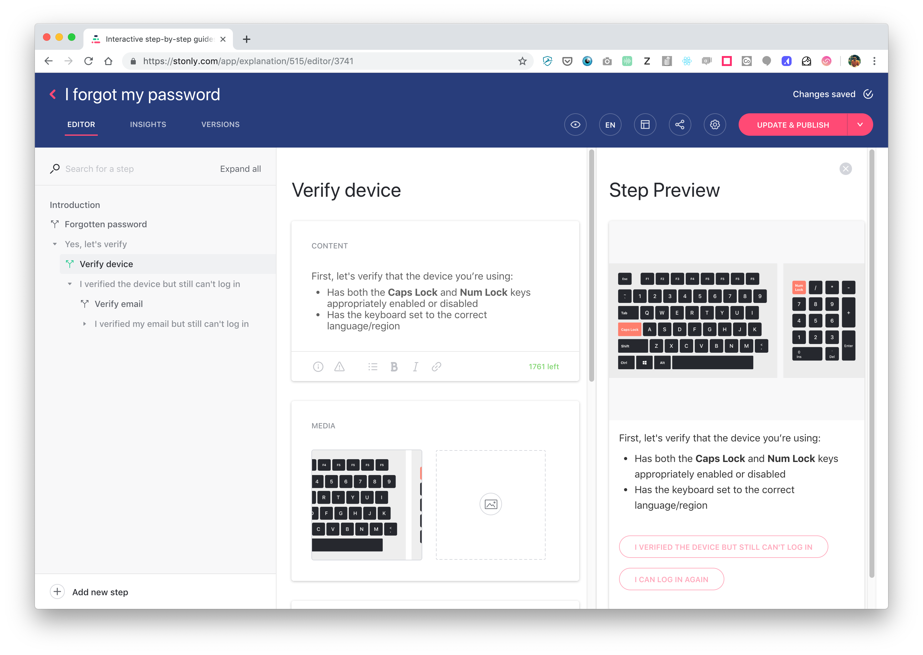
The digital guides you create with Stonly are called explanations, and they are composed of a series of steps; in fact, it’s the image of mounting steps that gives this company their name—think of stone steps leading up a rocky learning curve.
Teaming up
Whoever first creates and names a new explanation will be its owner. The owner sets up a team and invites others, with different possible roles: Publishers can do anything; contributors can edit but not publish; viewers have no editorial capacity. There can only be one owner, but that role is transferable.
Stepping to
Creating an explanation, step-by-step, is extremely intuitive and simple. If you know how to type text and position images, you won’t waste a second figuring the rest out.
The text is rich-format ready, meaning all the usual ways to make words stand out in a sentence. You can add emojis and there are many language possibilities for duplicating an explanation for different audiences, although you cannot use multiple languages in a single explanation.
As for rich media, you can add images, videos, icons or lines of code. With images, you can play around and superimpose shapes and arrows, or do highlights. With videos, you can upload something or embed a link from Youtube or other video sharing sites.
Users have access to a keyword search option within explanations, which searches through the texts and titles of each step.

Branching out
Branches is a feature which puts Stonly a cut above some of its competitors, it’s sort of a ‘choose your own adventure’ scenario right within a step.
Say, the explanation is teaching someone how to apply basic filters in video editing software. One step uses a lesson in slow-motion as an example of a basic filter. At the end of the step, the user may be faced with a question, with answers branching out into new explanations, like:
Would you like to continue learning how to apply basic filters?
Would you like to learn more tricks for slow-motion?
Choosing the first branch may continue the explanation the user was on, while the second branch may commence a new explanation. Even if one chooses the second branch, it’s easy to go ‘back’ to where one originally branched off from the initial explanation.
Feeding back
Sometimes the steps you’ve created may need some tweaking. This is where Stonly’s feedback feature comes in.
At each step, users can give their feedback, especially if the step isn’t doing its job. There’s an option to select from a list, describing a faulty step to be: wrong, useless, incomplete, or not understood.
There’s another option to simply leave a comment, where users can read comments left by others. If you’re using Stonly to make explanations, this is a great way to constantly improve them thanks to your customer feedback.
Seeing through
Stonly’s range of analytical insights are pretty robust, yet the displays eschew too many controls and variables in favor of concise and bold charts.
Within a set time interval, you see how many total visits there’ve been in that period, and by how much it’s gone up or down. Same thing goes for total steps completed during that period, as well as the average amount of time spent per session, as well as the time spent per step.
Conversely, you can see how much time was spent on each step as a percentage of the user’s total explanation duration.
The platform shows you how many people dropped off at each step as a percentage, and then the rate of people who opened a ticket at each step.
Finally, for those steps that give you choices, you see which branch is the most taken.
Trailing off
Integration
There are great opportunities to integrate Stonly with other platforms. Take customer-service experts Zendesk: With Stonly, customer support agents can leverage the utility of Stonly to help customers-in-need. You can also link FAQs with Stonly Zendesk.
Likewise with customer-messaging platform Intercom, where you can access all the customer’s Stonly activity when you are communicating with them, giving you a clear map of their journey through the guides. Stonly runs its own chat using Intercom too.
Mobilization
Another noteworthy tidbit: You can view Stonly on your mobile device; it is screen-size responsive. It should be noted however that you cannot currently edit in the mobile version.
Remuneration
There’s a free sign up, which is limited, but it may just be worth it to tinker around with Stonly for fun.
Otherwise, it’s $36 or $112 per month, with more perks as you go up. The main difference, however, is that the top “Team” plan is good for two users, with $15 per extra per month. The mid “Pro” plan is only good for a one-person show.
There are discounts if you pay yearly, and if you’re a team of more than 15, you can request a quote from Stonly directly.
Siemanko & au revoir
Stonly is so post-Sili-Valley. The Stonly team kick it back and forth between Krakow and Paris, the latter of which is aiming to edge up in the startup tech world, particularly the hood where Stonly sets up base.
CEO and founder Alexis Fogel’s idea behind it all was “to take the opposite stance of chatbots.” For Fogel, the current state of chatbot tech just ain’t knocking his socks off, and most people “often end up searching through the help center,” anyway.
Sure, bots have their pros and cons, but you could save a lot of time and money optimizing help pages when you control the narrative through guides. And when it comes to creating custom instructions to your software or website, explanations might just be less stressful than dealing with a bot: no pressure to enter a valid response.
Intuitive, interactive, human-centric, and leaving the user with a more relaxed customer experience, the ultimate effect of Stonly’s tool is of a job well done, step by step.


